Launching OfferUp

Buy. Sell. Simple.

The OfferUp home feed, photos only

The easiest way to buy and sell locally.

Company
OfferUp
Years
2014–2018
Team
Seven-person launch teamCEO, CTO, 1x Android Developer, 1x iOS Developer, 1x Web Developer, VP of Marketing, Lead Designer (me).
Role
Founding Product Designer

At a glance.

If we met in an elevator, this is what I’d tell you.

DealSpringer → OfferUp

I joined OfferUp mid-pivot as the Founding Designer and 5th employee. Our mission was to create the easiest way to buy and sell locally. The vision was to supercharge local commerce. I led design across product, brand, people, and ops. Our strategy: design for growth first, then engagement, then retention. After 3 years we had more than 15 million daily active users, 5+ min session time and a daily open rate over 80%.

Built to browse. Infinite window shopping, in your pocket, wherever you go.

In a mobile-first world, we kept the feed to photos only, built it as an infinite scroll with pull to refresh, and personalized it around what you were looking for, so there was always something to pique your interest and keep you hooked.

The OfferUp home feed, photos only

Safety first. Built for real people, not scammers.

From day one, every account was tied to Facebook, showing your “Facebook connections” on every product page, real names, 5-star ratings system with comments and TruYou verification program enhanced your listing discovery rank.

A profile with the TruYou badge, a five-star rating and friends in common

Conversion optimized. Always give the user value before asking for anything.

Intentionally designed to let users get the full experience without an account. Only asking them to create one in high leverage moments, when sending an offer or completing a listing.

A sign-up prompt over a written offer

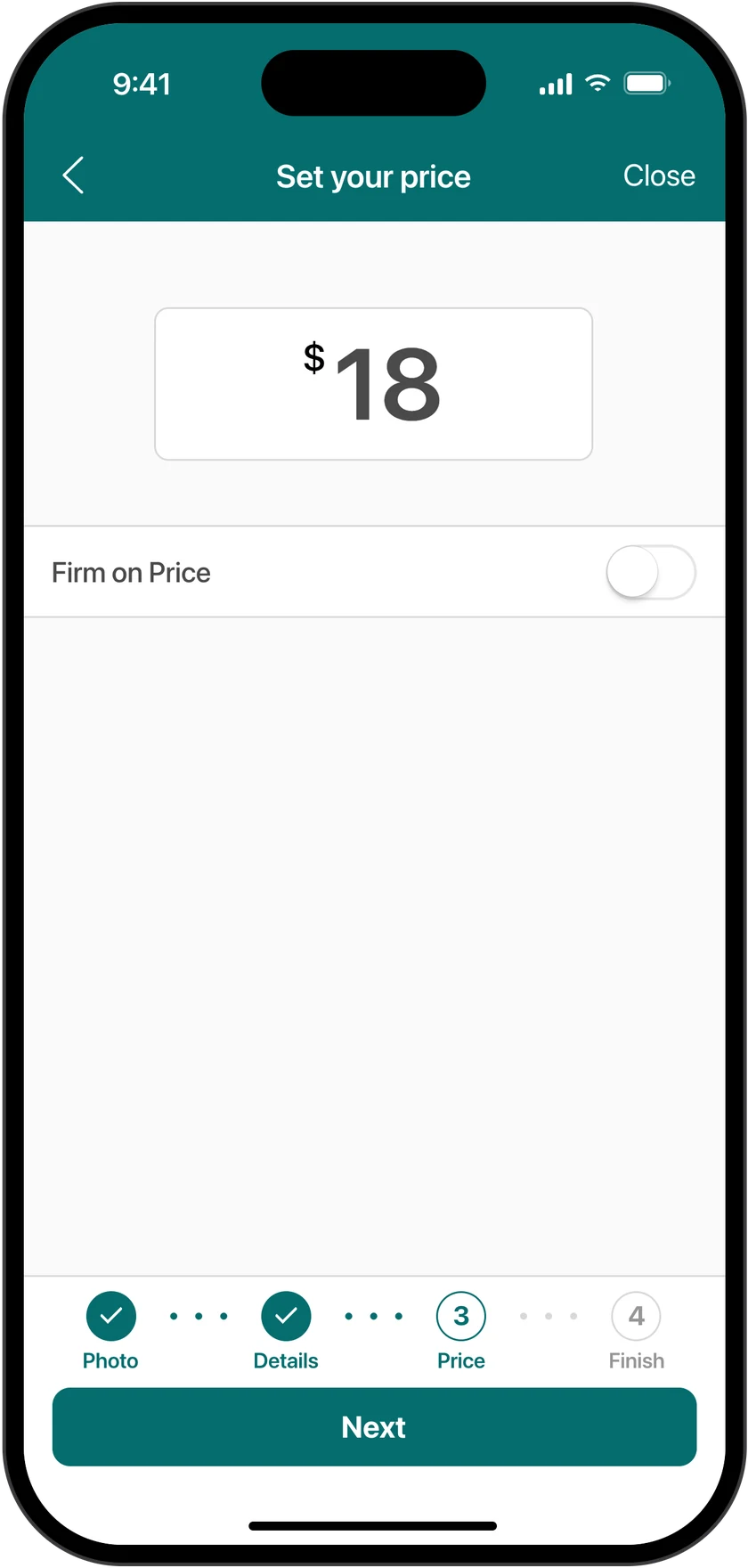
Quantity over quality. Post in seconds. A photo, a name and a price, everything else was optional.

To supercharge marketplace supply I designed a simple 1-2-3 posting process that could be done in seconds. Our research showed that photos were the deciding factor 90% of the time, so we chose to make all other product details optional, maximizing post flow conversion rate.

Step one, the photoStep two, the nameStep three, the priceStep four, Post

Built for organic growth. Every sale and listing posted to your Facebook homefeed with a success story.

Facebook login only, so every new listing and every sale posted to your feed. Friends saw what you were selling. Large invite button at the top of the home feed and a big share button on every item page. Peak viral coefficient of 2.1.

A social post reading I just sold this on OfferUp, with a share sheet

The big idea

There had to be an easier way to buy and sell locally.

A leather armchair in a cluttered garage, from Life of a Chair

Challenge, plot twist

Target acquired & 9 months to prove it.

The DealSpringer home page, with a map of Seattle and coupons from nearby shops

Couponing app → marketplace

9 monthsto prove it
0 → 5,000users to earn the next round

OfferUp started as DealSpringer, a location-based coupon app for retail. When I joined, the pivot to a peer-to-peer marketplace had just begun. One of OfferUp’s first angel investors had given us a goal. Acquire 5,000 users in 9 months she would lead a new $1.5m seed round at a $5 million valuation.

Research, no stone left unturned

Working backwards from the gaps in the market.

We put our first $20,000 into research. In five weeks we talked to more than 1,700 people, and about 30 percent of them had never bought or sold peer to peer at all.

Coffee for 15 minutes.We bought people coffee at Starbucks in exchange for a 15-minute interview.

Selling to learn.We sold hundreds of used things on Craigslist, eBay, and Facebook buy-and-sell groups, and gave people a discount to let us interview them about the experience.

A lab in the office.We set up a lab in our office, where I watched hundreds of people buy and sell, live.

People who’d never tried.Focus groups with people who had never used any of these platforms, to find out what was holding them back.

Here’s what we learned.

Craigslist had the people, but no way to know who you were dealing with.

eBay had the structure, but listing was complicated and shipping cost too much.

Facebook groups had the trust, but no listings, no search, and no way to tell if something had sold.

People who’d never tried told us what it would take: real identities, built-in messaging, and listings with photos.

Then, a prototyping lab.

After the first round of research, we set up a prototyping lab. 10 to 20 people came in every week to test working prototypes and give us feedback on each workflow.

  • Posting
  • Making offers
  • Searching
  • Filters
  • Asking sellers questions
  • Account setup
  • ID verification
  • Marking sold

Wheels on the bus

We didn’t want to build just another tool.

A public profile with followers and friends in common

Amid the app explosion, we quickly realized our real competition wasn’t other buy-and-sell marketplaces. It was social apps like Instagram and Pinterest, competing for the same minutes on the bus, and the same investor dollars. An investor could back the apps everyone was already opening every day, or back OfferUp. So we built OfferUp to be a social platform, and measured ourselves the way social apps were measured.

  • Daily active users
  • Time in the app
  • Sessions per day
  • Unique item views per session

A need for speed

Fewer debates. Faster decisions.

A product has a million small details, and early on we got stuck debating them. So we set design tenets: simple rules for when two good ideas conflict.

  • Photos over everything. Photos only in the feed, because people viewed far more items.
  • More listings over perfect listings. Everything optional except photos, name, and price.
  • Value before effort. No account and no permissions until they mattered.
  • Everyday people over power users. Friendly and homemade over polished.

Moments of leverage

Funnels built to engage, convert, and retain.

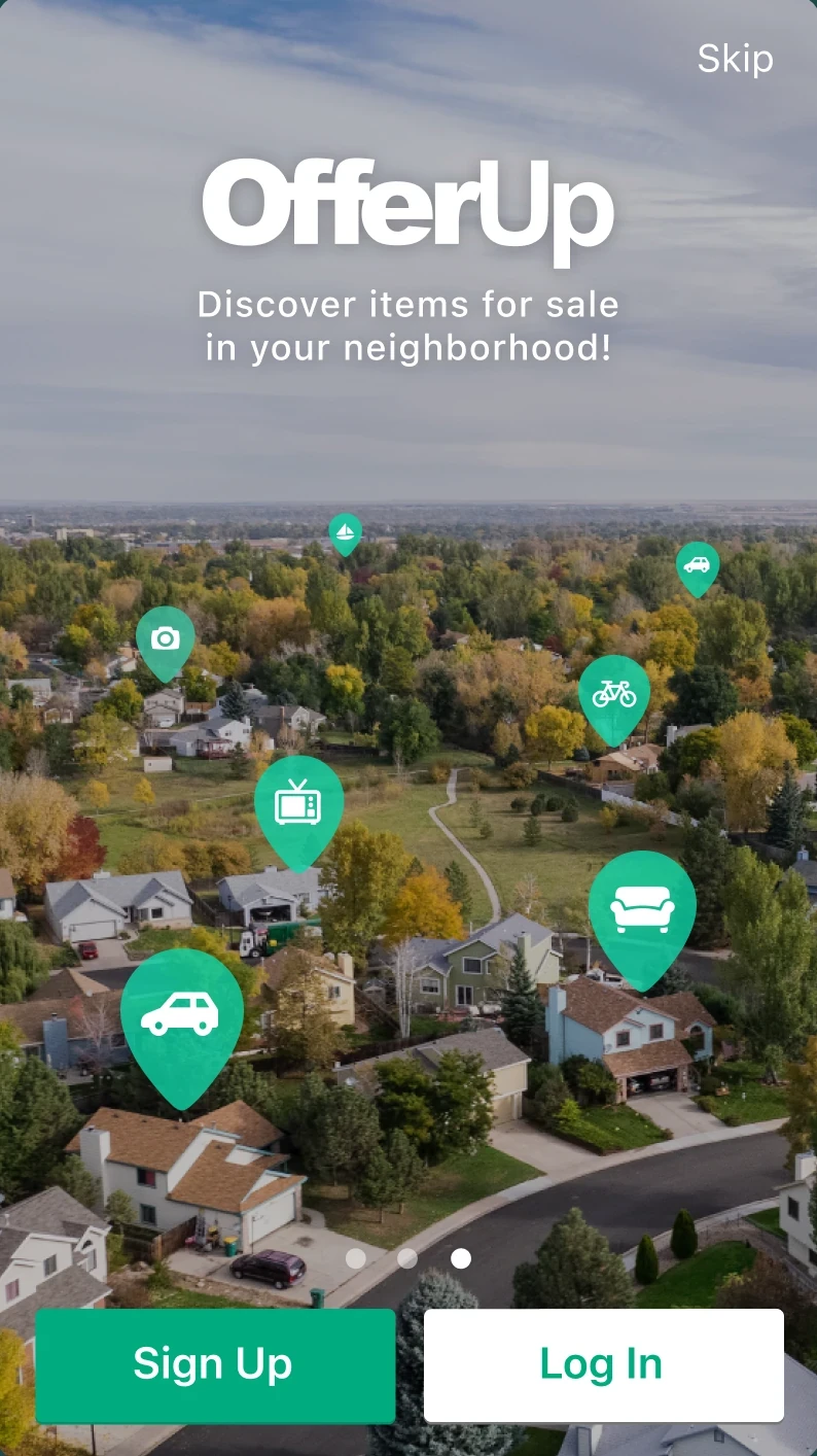
The original welcome screen, with Skip at the top

No permissions until we needed them. No account until the moment it mattered.

  • Start shopping right away
  • Write the offer, then sign up
  • Post first, then sign up
  • Ask after the effort, not before

Photos first

Seeing is believing.

Everywhere in the marketplace, we optimized for what people wanted most: the photos. 90 percent of people decided from the photos alone.

  1. 0.Nearby
  2. 1.Photos
  3. 2.The seller
  4. 3.Price
  5. 4.Everything else

Safety first

Know who you’re dealing with.

A seller's profile with ratings and reviewsRating a seller from one to five stars
40%better sell-through for TruYou members

At every step, we wanted people to feel as safe as possible buying from, and selling to, someone they’d never met.

  • Ratings from 1 to 5 stars after every transaction
  • TruYou verification, with a full criminal background check to be approved
  • TruYou members ranked higher in search, and buyers could filter for TruYou only
  • Join TruYou front and center at the top of every profile
  • Facebook profile photos, with face detection that asked people to fix photos without a face
  • First name and last initial

Snap and sell

Snap. Name. Price. Post.

The in-app camera with a mug in frame

Photos came first, because you couldn’t post without one, so the required part was done right away. It also kept scams out: every listing needed a live photo taken in the app, so fake and stock photos never made it in. Then a name and a price. Everything else was optional. The last step showed your item exactly as buyers would see it, with one button: Post.

  • Live photos only. No uploads from the web, so no fake listings.

The magic word

Ask, don’t message.

An item page with Ask and Make offer floating at the bottom
2xsell-through when a sale starts with Ask

Every item page had two buttons floating at the bottom of the screen: Make Offer and Ask. “Ask” registered right away, since most people had a question. And transactions that started with Ask sold through at twice the rate.

Designed for growth

Growth wasn’t a marketing plan. It was built into the product.

Pass it on

Every listing, an invitation.

2.1Viral coefficient

We launched with one way to sign up: Facebook. It saved us time, and it made OfferUp social from day one. Every new listing posted to your Facebook feed, and every sale did too. Friends followed the link, saw what you were selling, and wanted to try it themselves.

  • Facebook login only, at launch
  • New listings posted to your feed and profile
  • Sold posts: “I just sold this on OfferUp.”
  • An invite button at the top of the home feed
  • A big Share button on every item page

Block by block

Density before scale.

Items on a map of the neighborhood
$50Kin ads before organic growth outpaced paid

New users found nothing nearby and left. So we focused on a few cities at a time, starting with Seattle, Phoenix, and Sacramento.

Going prime time

Ten spots. Up to 30,000 downloads a week.

I directed and produced ten social and TV spots, including Life of a Chair. Weekly downloads went from 3,800–8,000 to 12,000–30,000 while they aired.

Local flavor

Feels like home.

An OfferUp magazine ad

Our early adopters came for deals. The more polished we made the app, the less interested they were. So OfferUp was designed to feel like the local diner, not the corporate steakhouse.

Building the largest peer-to-peer marketplace in the world.

15Mdaily active users
$14B+in transactions in a single year
Nearly 30 minutesa day in the app for our most active users
$1.3Bvaluation

Awards

  • Best New App, Shopping, Apple App Store, 2015
  • App of the Year, Shopping, Apple App Store, 2016
  • Top 5 App of the Year, Google Play, 2017

Let's build incredible0→1 products together.

0→1 products =UrUser Research+UxUser Experience Design+PtPrototyping+TsTesting